Hey, hey! I can’t even begin to tell you how happy I am to finally see this beast go by the wayside. I hated this bathroom, much less using it! Needless to say, this room was in desperate need of a cottage style bathroom reno. There’s still lots to do, but I wanted to give you a sneak peak into the progress so far. Here are a few before and after pictures to give you an idea of how it’s coming along…
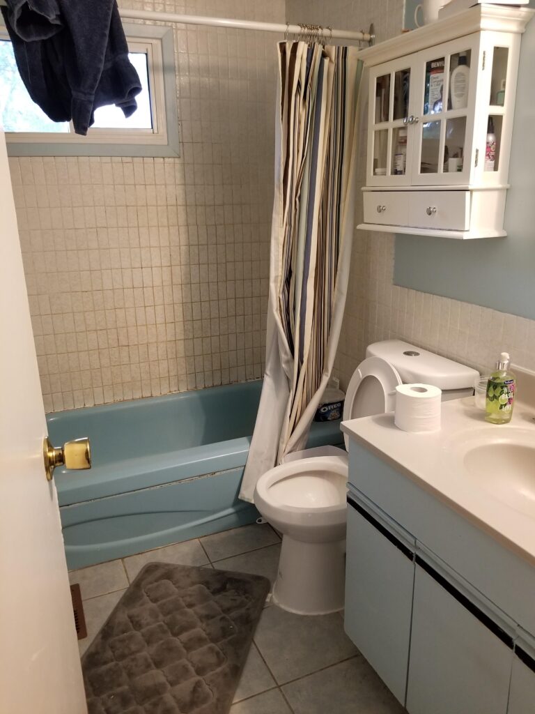
Before:
As you can see the entire bathroom was in desperate need of a complete redo. So far, we’ve, replaced all the drywall, put in new floors, a vanity, tub and lighting, as well as a simple but sweet little mirror.
AFter:
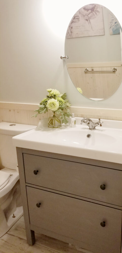
The vanity is the Hemnes Rattviken vanity from Ikea. It comes with a ceramic sink and is one of the most affordable vanities you will find. The simple clean lines really suit a rustic farmhouse, cottage or coastal style bathroom.
The space between the vanity and light fixture was small, so I went on the hunt for a mirror that was adjustable for taller folks, but just the right size for the space. This is the Banbury series by Moen available at Home Depot. They have a matching towel bar and other accessories if you’re into that. I’m not a huge fan of “matchy, matchy” but the cheaper options at the home décor stores, just don’t hold up over time. I bought the set for this bathroom which came with the hand towel ring, the toilet paper roll holder and the towel bar. There is a notable difference in quality for sure, so I’m happy 😉
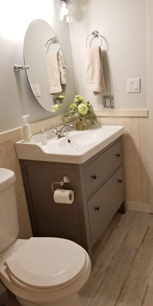
This tiny space makes it tough to get a good picture! Ignore the unfinished light switch, but here’s another view of the vanity and wainscoting.
To give an extra rustic feel to the space, we went with 6×36-inch ceramic flooring from Home Depot, called Enigma Boreal White . This stuff looks like old whitewashed barnboards. The worn plank style along with the soft white tone, really helped to open this tiny space up. Best of all, it was easy to install and budget friendly.
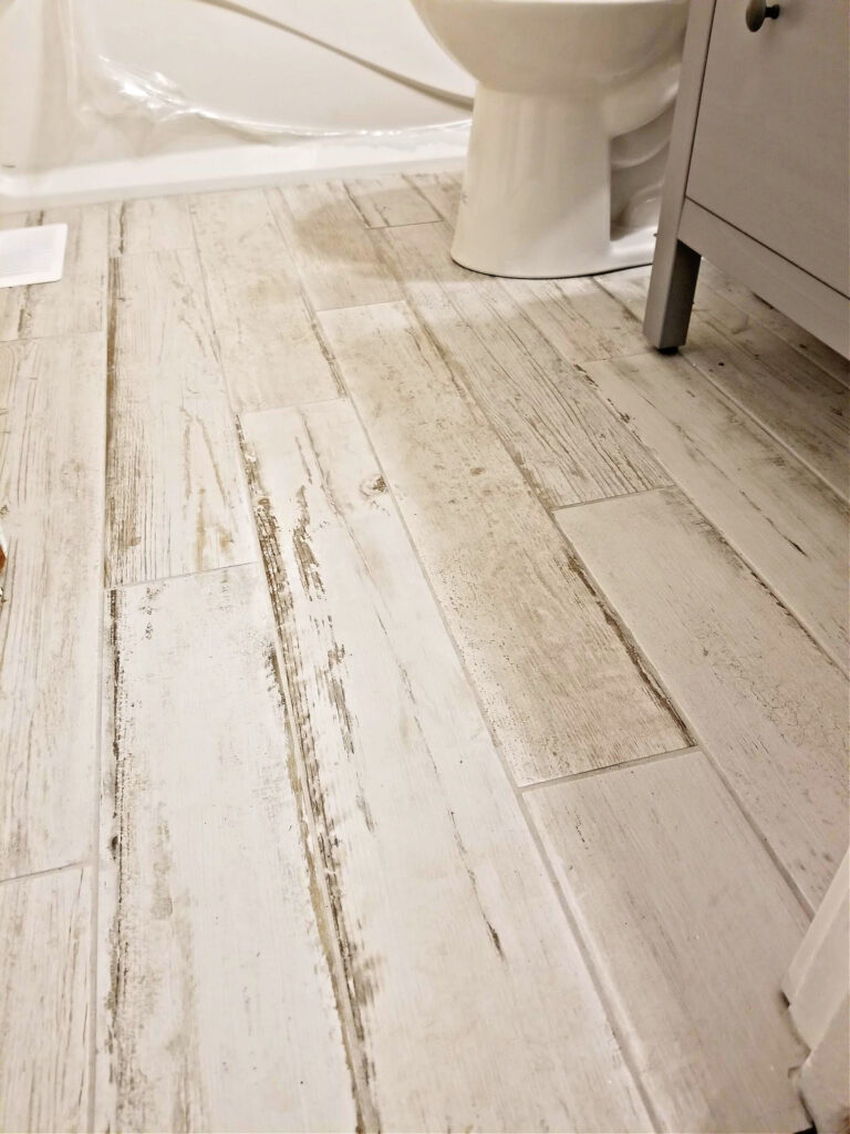
a cottage style bathroom Reno – Must haves
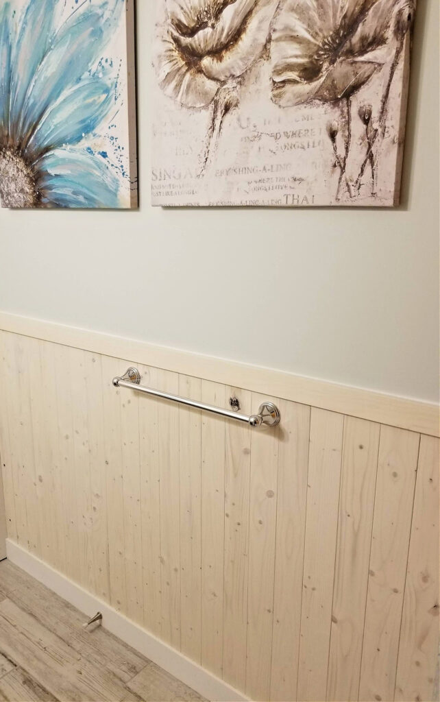
In my mind, any cottage style bathroom reno has to have a light and airy feel to it. Because this space is small, the lighter colours also help to make it feel more spacious. The wall colour is Silver Crest by Benjamin Moore. It’s a green grey with a hint of blue, that adds a soft coastal hue to the room. To amp up the cottage style, we added wainscoting using pine boards and for a coastal feel, we whitewashed each of the boards. Whitewashing really helps to cut back some of the yellow tone in pine, while letting the natural beauty of the wood grain show through. I went with a very subtle wash to make it look like driftwood. Here’s a clip showing you 3 easy steps for whitewashing pine.
Check out how the walls turned out! We used a few boards with knots for extra character.
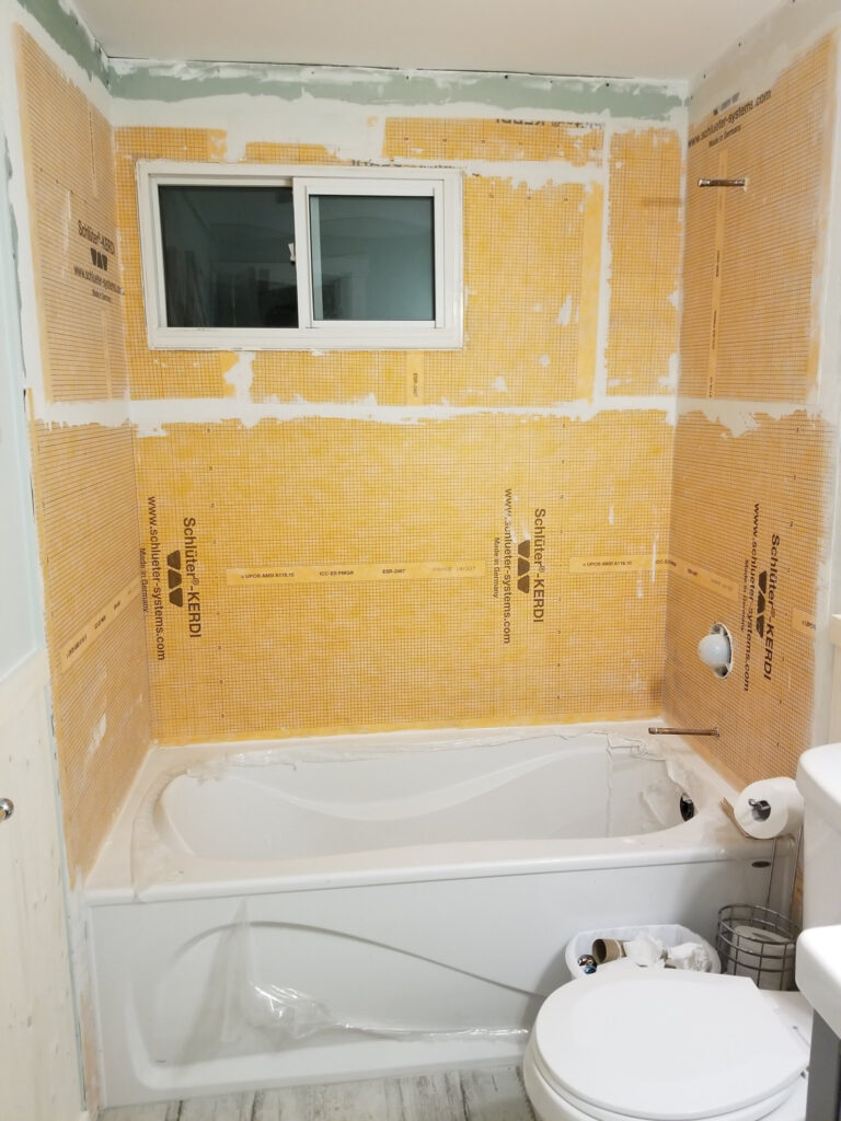
to do:
So what’s left to do? Well here’s a final photo… yep, tiling! Lot’s of tiling. I think white subway tiles with white grout will look clean, simple and will add to the cottage charm. What do you think? I’d love to hear your ideas. Leave me a comment below with some suggestions!
So there you have it. A 1960’s bathroom almost ready for the the 21st century :). I can’t wait to have a bathtub again! I’m hoping to have it finished before Christmas, so check back soon to see how it turns out! If you’d like to see our progress on the rest of Blossom Road, check out our farmhouse style living room make-over. Thanks for reading and see you soon!

I love this. Calm, mellow, a place you world no problem lingering here. Beautiful job, design and execution well thought out and beautifully finished!
Thankyou! So looking forward to having it finished ☺️
Do you recall which color of grout and joint width that was used for the 6×36 boreal whitewashed porcelain tile? Did you use sanded or unsanded grout? Floors look amazing! We will be installing the same tile in our home. Thanks!
Hi there Martin! Thanks for the comment 🙂 The joint width for the bathroom tile was a 1/4 inch and we used sanded grout for sure, but I can’t recall 100% what the colour was. Looking at the grout colours available from the Mapei line though, I’m pretty confident it was the colour 38 Avalanche. I really just wanted the grout lines to blend in rather than stand out like a bright white would have. That said, all of the lighter grout colours darken overtime, so I’m not sure how much of a difference it makes in terms of which one you select. Any one of the lighter shades from their Serene collection will look great. Hope this helps!
Thank you so much! I really want that grout colour to blend in with the tile to make it look almost invisible :). Your Renos look stellar! Cheers
You’re welcome! Feel free to share a pic of yours if you get around to it. I love to see other peoples renos. Ciao!